SpiderOak Semaphor Messaging title

SpiderOak

Secure Software

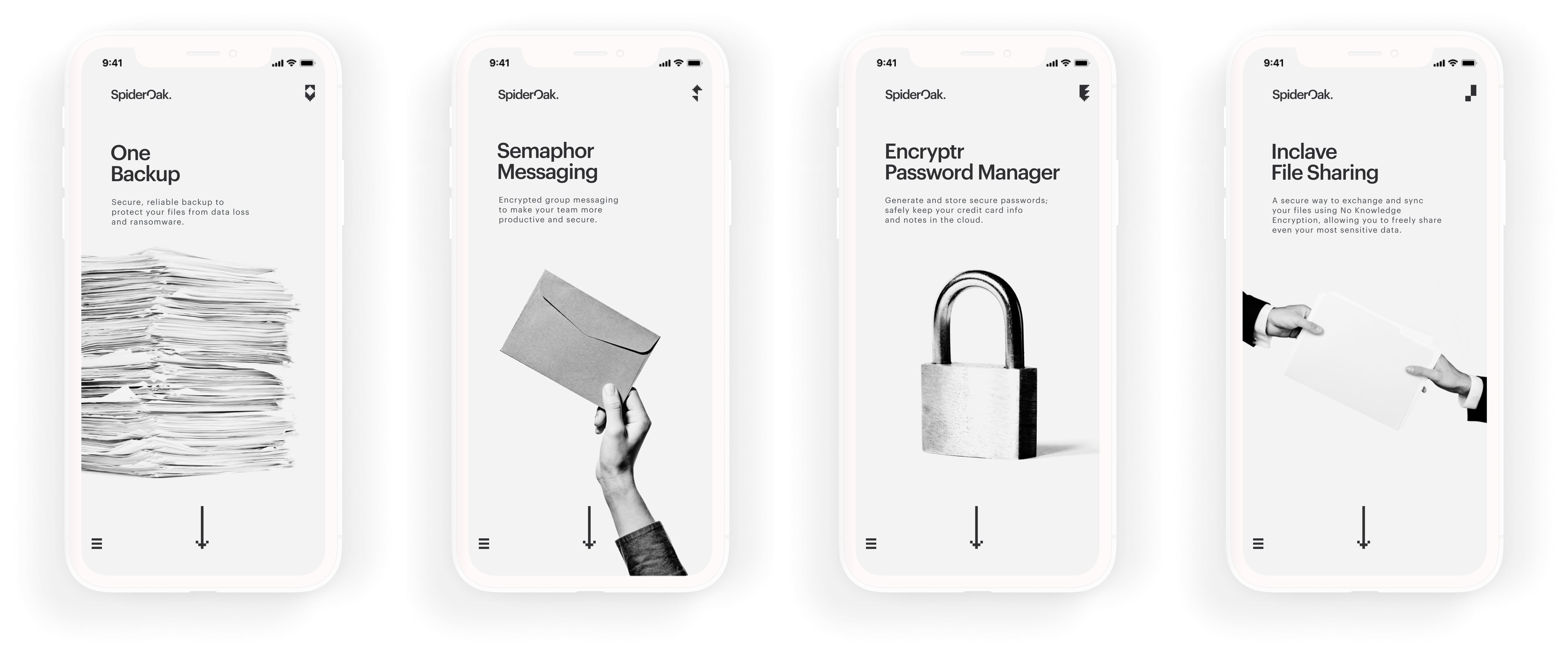
Despite a loyal following among security enthusiasts for SpiderOak’s flagship One Backup product, the response to the applications in the years that followed was sorely underwhelming. With the redevelopment of its private blockchain platform, the company was looking to take things in a new direction. Pivoting sharply from the consumer market it had known for over a decade, SpiderOak sought to position itself as indispensable technology for defense and intelligence communities within the United States government. This new business-to-business direction required a straight-forward, no-nonsense approach in all of the company’s brand and marketing communications.

Kansas City, KS, USA

Securing the world's data, bit by bit.

Brand Concept

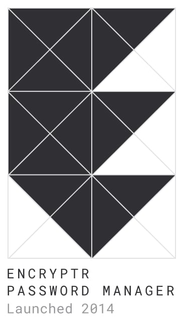
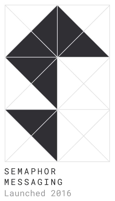
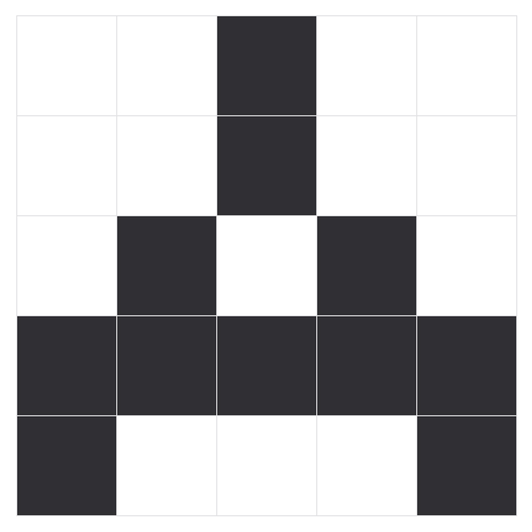
Bit by bit, or, little by little. A “bit” being the smallest unit of data in a computer, the line is also a nod to the small startup’s scrappy resilience, managing to do more with less in the face of numerous hurdles throughout the years. Original SpiderOak brand designs were even based on old school 8-bit styles.

What better metaphor for blockchain than tiny clusters of squares—a chain of blocks in the form of pixels. The very nature of 8-bit is simplification, and SpiderOak had been struggling for years not to come across as too technical. Recalling the earliest days of computers, when pixel icons were first created to make the incomprehensible technology more intuitive and user friendly, SpiderOak needed a similarly simplified “less is more” approach to connect current and future audiences with its innovative security-first blockchain technology.

Logo System

Art Direction, Logo Design

Although the SpiderOak brand had struggled to find solid footing over the years, the original three product logos, at least, had never changed. Wanting to maintain some continuity between these mainstays and the newest branding concept, the logo system naturally expanded using the same geometric grid of precise triangles and squares.

Logo System

Art Direction, Design

Although the SpiderOak brand had struggled to find solid footing over the years, the original three product logos, at least, had never changed. Wanting to maintain some continuity between these mainstays and the newest branding concept, the logo system naturally expanded using the same geometric grid of precise triangles and squares.

SpiderOak One logo design grid
SpiderOak Encryptr Password Manager logo design grid
SpiderOak Semaphor logo design grid
SpiderOak logos mobile

Icon Set

Art Direction, Design

The 8-bit icons, often coupled with Roboto Mono, are used throughout the brand to indicate points of user interaction.

Such “clickable” elements feature prominently throughout the website, of course, while acting as more intentional accessories in print—listing the company website, for instance, or calling attention to a pull quote.

SpiderOak 8bit character set

Whitepapers

Art Direction, Editorial Design, Infographics

Blockchain is no easy concept to explain, so SpiderOak’s marketing materials needed to be as digestible as possible. Strongly gridded layouts, inspired by the International Typographic Style, helped to break content up into manageable blocks, improving comprehension, building trust, and providing yet another visual metaphor for the underlying blockchain technology. Effective grid systems also enabled consistent and flexible templates across print and web alike. Whitepaper covers were inspired by the timeless posters of Swiss Design.

SpiderOak whitepaper cover

Art Direction, Web Design, Web Development

SpiderOak Whitepapers mobile web design

Products

Art Direction, Design

Again taking cues from Swiss Design, black and white photography served as effective at-a-glance communication for objectivity and clarity.

SpiderOak whitepaper cover

Downloads

Art Direction, Web Design, Web Development

With software updates constantly underway, SpiderOak needed a way to automatically publish the latest Release Notes and downloadable versions. The Hugo static site generator and some clever collaborative coding between Marketing and DevOps enabled continuous deployment for easy updates.

SpiderOak Downloads web design mobile
SpiderOak Downloads web design cover

Downloads

Art Direction, Web Design, Web Development

With software updates constantly underway, SpiderOak needed a way to automatically publish the latest Release Notes and downloadable versions. The Hugo static site generator and some clever collaborative coding between Marketing and DevOps enabled continuous deployment for easy updates.

SpiderOak Downloads web design

Release Notes

Art Direction, Web Design, Web Development

SpiderOak Release Notes Inclave 2.3.0 tablet

Alphabet

Art Direction, Design

In need of a strong accessory headline font, a pixel-based character set seemed the logical choice. The strong square shapes complement the logo system in a way that Roboto Mono, even bold, could not, as illustrated in the Release Notes.

SpiderOak alphabet character set

Portraits

Art Direction, Photography

In preparation for a surge of hiring with an upcoming round of funding and the need for more people experienced in the government sector, SpiderOak wanted to add more personality and approachability to the About page on the website. Portraits of the leadership team showcased some of the primary faces behind the company.

SpiderOak photography leadership team portraits